It’s no secret that gains from the robust economic recovery following the Great Recession have disproportionately gone to a small number of areas in the United States. For instance, 20 metropolitan areas collectively account for about one-quarter of the country’s population, but over 40% of job growth since 2010. Additionally, employment in urban areas since 2010 has grown nearly four times as fast as rural employment.
While the past decade’s recovery has drawn increased attention to the growing inequality in economic outcomes across regions, these trends have, in fact, been ongoing for several decades. Since the 1980s, a decade marked by rising income inequality and a pronounced shift in jobs from the manufacturing to the services sector, large portions of the United States have seen their economic fortunes stagnate. The interactive map below shows the change in inflation-adjusted median household income by county in the United States between 1980 and 2015. Median household income is a measure of the economic prosperity of the median or “typical” household and is, thus, arguably more preferable as a measure of prosperity than average per capita income, which can be skewed by high-earning individuals. Data on median household income comes from the 1980 U.S. Census, while data on the median household income in 2015 comes from the 2013-2017 5-year American Community Survey, which takes an average of each year from 2013 through 2017, centered on 2015.
Counties in red have seen inflation-adjusted median household income decrease over this period, while counties in blue have seen increases in median household income. The map shows that in most counties in the major coastal metropolitan areas, incomes have risen sharply since 1980. For instance, in Loudoun County, Virginia, which transitioned from a rural county in 1980 to an affluent suburb of Washington by 2015, incomes have risen by roughly 79%. In Manhattan (New York County, New York) and San Francisco (San Francisco County, California), two poster children for the rise of the so-called “superstar” city, incomes have roughly doubled since 1980.
Outside of the major coastal metropolitan areas, however, a different picture emerges. While there are some areas of visible increases in prosperity, such as the Texas Triangle and parts of the Upper Midwest (North Dakota, South Dakota, and Minnesota), more striking are the large areas in which incomes have notably declined since 1980. The largest declines are visible in four regions: one encompassing a large part of West Virginia, Eastern Kentucky, and Southwest Virginia, one containing a swath of industrial counties stretching from Illinois into Western Pennsylvania, and upward into Michigan, a third consisting of a large number of rural counties in the Deep South, and a fourth consisting of many scattered counties in the Interior West. In Genesee County, Michigan, which contains the industrial city of Flint, incomes have declined by 27% since 1980. Likewise, in Buchanan County, Virginia, which has an economy heavily reliant on coal mining, incomes have declined by 32%. Overall, this map paints a clear picture of regional divergence; many large metropolitan areas with economies rooted in information and services have thrived over the past several decades, while areas more dependent on manufacturing, mining, and agriculture have struggled.
One critique of the above map is the overemphasis on rural counties. For instance, maps showing county-level presidential election results make it appear as if the country overwhelmingly votes Republican, because most counties are quite rural and most rural counties vote for Republican candidates. Because counties with the strongest income gains tend to be urban while many of the regions with large income declines are rural, the map may be overstating the problem of regional declines if few people actually live in these regions.
The below map attempts to correct for this by showing counties not as their actual shapes, but rather in circles sized according to their populations. While the income declines in the Interior West and Deep South become much less pronounced, the map makes it clear that a substantial portion of the U.S. population still lives in counties that have seen income declines, especially in the Rust Belt. For instance, the three main counties in the Detroit region, Oakland, Wayne, and Macomb, collectively contain nearly four million residents and have all seen income declines since 1980. Perhaps surprisingly, Harris County, Texas, which contains Houston and has gained approximately two million new residents since 1980, has seen a decline in real median household income of 6%.
The maps above support the notion of rising spatial inequality across regions within the United States. They say little, however, about inequality within regions or metropolitan areas. Even the wealthiest counties contain some number of lower-income residents, and vice versa. Thus, it is worth examining the local neighborhoods in which residents actually live, to see the degree of income segregation within counties and regions.
The bar chart below looks at the evolution of spatial inequality at the neighborhood level by considering the income ranges of census tracts in 2000 and 2015. A census tract is the smallest geographic unit for which the Census Bureau regularly collects economic and demographic data and is generally defined as an area containing between about 2,000 and 8,000 residents. In urban and suburban regions, census tracts closely correspond to what people might colloquially consider to be neighborhoods. Because census tracts did not cover the entire country until the 2000 Census (they were originally defined for urban areas), the bar chart considers the years 2000, using 2000 Census data on median household income by tract, and 2015, using the 2013-2017 5-year American Community Survey.
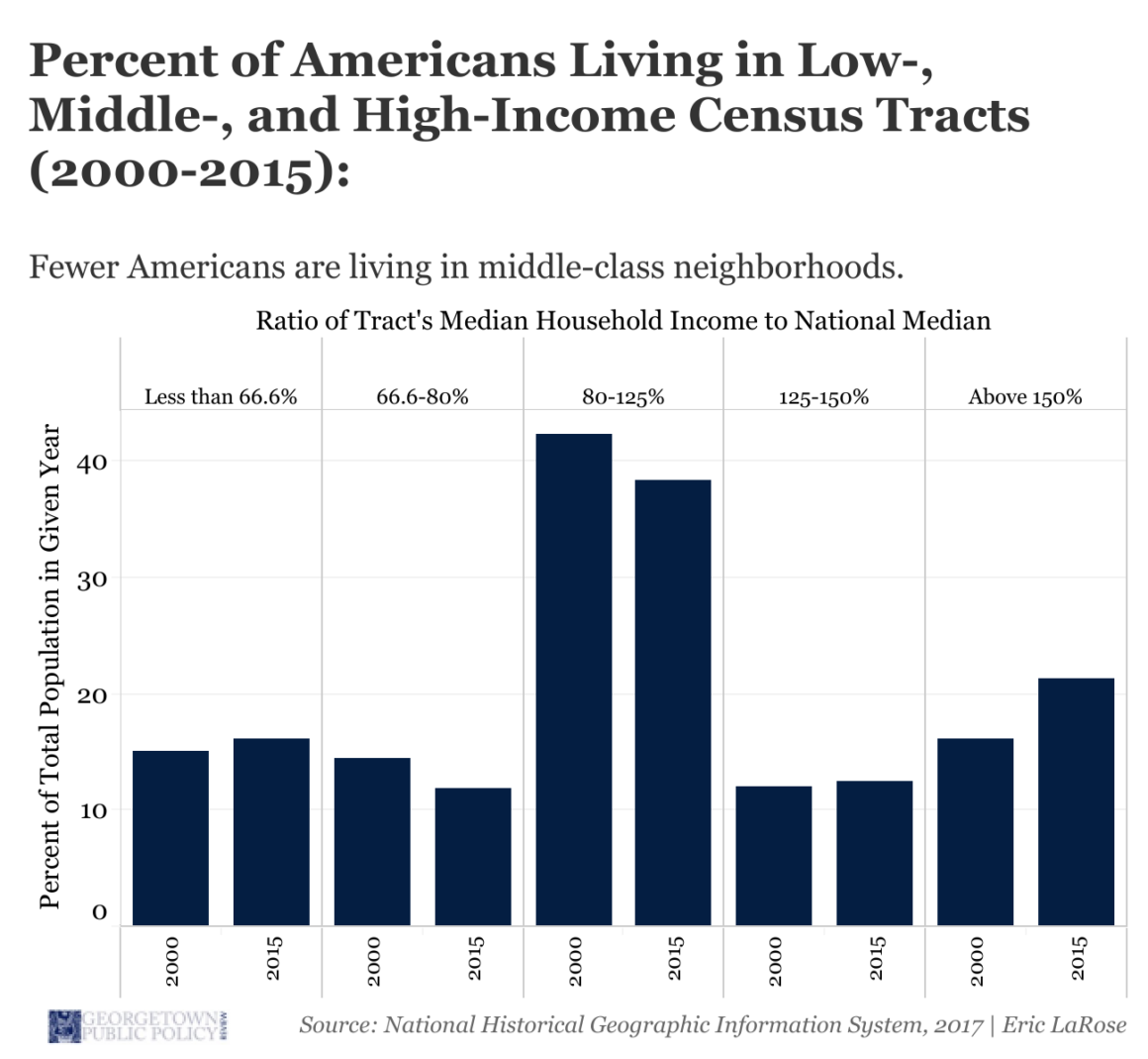
In each year, for each census tract the ratio of the tract’s median household income to the national median household income is calculated, and tracts are then grouped into one of the five bins shown in the chart. A tract whose median household income is between 80% and 125% of the national median can be thought of as a relatively middle-class tract. On the other hand, a tract where median incomes exceed 150% of the national median is quite wealthy, and one where median incomes are below two-thirds of the national median is relatively poor. Within both years, the percentage of Americans who live in tracts within each of the five income bands shown in the chart is calculated.
This bar chart also shows a relatively clear trend. There has been a pronounced decrease in the percentage of Americans living in middle-class tracts, defined as those with median incomes between 80% and 125% of the national median. In 2000, 42% of Americans lived in such tracts; in 2015, 38% did, a decrease of roughly 10%. On the other hand, there has been an increase in the percentage of Americans living in relatively wealthy and poor tracts. For instance, in 2000, 16% of Americans lived in tracts where median incomes exceeded 150% of the national median; in 2015, 21% did, an increase of nearly one-third.
Overall, these visualizations find evidence supporting two key points. First, there has been strong regional divergence in incomes since 1980, with large income gains concentrated primarily in coastal metropolitan areas. Second, even within regions Americans increasingly live less in middle-class neighborhoods and more in neighborhoods which are either substantially wealthier or poorer than the nation as a whole.